
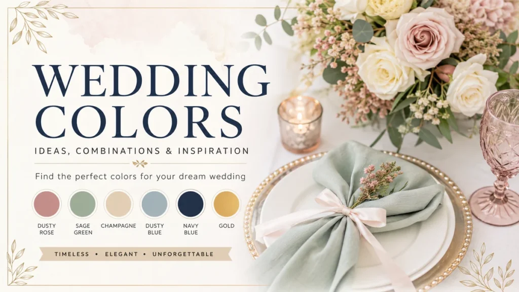
Choosing wedding colors sounds simple until you start comparing dozens of shades of green, pink, blue, cream and gold. Suddenly, sage isn’t just sage, white isn’t just white, and that beautiful Pinterest palette looks completely different under your venue’s lighting.
The good news is that a successful wedding palette doesn’t depend on finding one “perfect” color.
Wedding colors are a coordinated group of hues used throughout your celebration to create a consistent visual mood. A balanced palette usually combines dominant colors with supporting neutrals and smaller accent shades, then carries them naturally through flowers, stationery, wedding-party attire, linens, tablescapes and décor.
This guide explains how to choose colors that work together, which combinations suit each season, what’s influencing 2026 weddings, and how to avoid the mistakes that can make an otherwise beautiful palette feel disconnected.
How to Choose Wedding Colors That Actually Work
Your wedding color palette is essentially a small design system.
It helps connect your invitations, ceremony, reception, flowers, attire and decorative details without requiring every element to match exactly.
The Knot recommends starting with roughly two to five designated colors, potentially divided into primary, secondary and accent hues. Current wedding design is also moving toward more nuanced groups of shades instead of rigidly matching every item to the same exact color.
Here’s a practical way to build your palette.
1. Start With the Feeling, Not the Color
Before opening a color chart, decide how you want the wedding to feel.
For example:
| Desired Mood | Colors to Explore |
|---|---|
| Romantic | Blush, rose, mauve, ivory |
| Elegant | Black, ivory, champagne, gold |
| Fresh and natural | Sage, cream, dusty blue |
| Dramatic | Burgundy, emerald, navy, plum |
| Coastal | Ocean blue, sand, white, seafoam |
| Rustic | Terracotta, rust, olive, beige |
| Joyful | Coral, peach, yellow, pink |
| Modern | Black, white, taupe, metallics |
| Garden-inspired | Lavender, sage, blush, butter yellow |
This approach prevents a common problem: choosing individual colors you love but discovering later that they don’t create the atmosphere you imagined.
A formal ballroom wedding and a relaxed garden ceremony can technically use the same blue, for example, but they probably shouldn’t use it in exactly the same way.
2. Look at Your Venue Before Finalizing Anything
Your venue already has a color palette.
Look at the walls, flooring, curtains, carpeting, furniture, gardens, architecture and permanent fixtures.
If the ballroom contains warm cream walls, dark wood and brass fixtures, champagne and burgundy may integrate naturally. A palette dominated by icy gray and electric blue could require considerably more work.
Outdoor venues have their own built-in colors.
A garden gives you greenery and floral tones. A beach gives you sand, water and sky. A forest venue provides brown and green. Instead of competing with those colors, treat them as part of your palette.
Venue compatibility is one of the most practical considerations when choosing wedding colors; established planning advice similarly recommends accounting for existing colors that can’t easily be removed or concealed.
3. Build a Palette Instead of Picking Two Matching Colors
Older wedding styling often revolved around combinations such as “pink and gold” or “navy and white.”
You can create much more depth by working with families of color.
Instead of:
Sage + white
Try:
Sage + eucalyptus + warm ivory + taupe + antique gold
Instead of:
Burgundy + gold
Try:
Wine + burgundy + dusty rose + cream + brushed gold
The result tends to look less manufactured because nature rarely presents colors in perfectly matched pairs.
This layered approach is especially relevant to 2026 wedding colors. Wedding-industry trend reporting points toward couples using several related shades and focusing more on the overall experience and aesthetic than perfect color matching.
4. Give Each Color a Job
Once you’ve selected your shades, decide how heavily each one should appear.
A useful framework is:
- Dominant color: establishes the visual identity.
- Secondary color: provides contrast or depth.
- Neutral: gives stronger shades breathing room.
- Accent color: creates smaller moments of interest.
- Metallic: optional finishing detail through gold, silver, brass or copper.
You don’t have to apply a mathematical formula to every centerpiece.
The point is visual hierarchy.
If emerald green, burgundy, navy, gold and bright pink are all competing for equal attention, the room can become visually noisy. If emerald dominates while ivory provides space and gold appears selectively, the design becomes easier to understand.
Quick Takeaway: Your colors don’t need equal representation. Choose a hero shade, supporting tones and restrained accents.
Best Wedding Colors for Every Season
Season is useful inspiration, not a rulebook.
Spring doesn’t require pastels, and winter doesn’t require burgundy. The better question is how a palette interacts with seasonal flowers, natural surroundings, available light, fabrics and the atmosphere you’re trying to create.
Spring Wedding Colors
Spring naturally suits botanical greens, airy neutrals and floral-inspired colors.
Beautiful combinations include:
| Spring Palette | Overall Style |
|---|---|
| Sage + ivory + blush | Romantic garden |
| Lavender + sage + cream | Soft botanical |
| Dusty blue + blush + ivory | Classic |
| Peach + butter yellow + green | Cheerful garden |
| Mauve + eucalyptus + champagne | Refined romantic |
| Pastel pink + lavender + mint | Whimsical |
| White + fresh green + pale blue | Clean and natural |
One particularly flexible combination is lavender and sage.
Lavender supplies gentle color without becoming overwhelmingly feminine, while sage provides a muted botanical base. Cream or warm white can then soften the contrast.
For a more contemporary spring celebration, consider stronger pinks instead of pale blush.
Summer Wedding Colors
Summer can handle brighter saturation, especially for outdoor, coastal and destination weddings.
Try:
Coral + peach + cream + greenery
for a warm celebration, or:
Ocean blue + white + sand + soft yellow
for a coastal atmosphere.
Other strong summer wedding colors include:
- Cobalt blue and white
- Coral and teal
- Peach and sage
- Lemon yellow and soft blue
- Fuchsia and orange
- Dusty blue and champagne
- Terracotta and cream
- Pink and green
Summer sunlight can make clearer colors look particularly energetic. Outdoor seasonal guidance also commonly recommends blues, greens, corals and yellows for summer while emphasizing that season should guide rather than dictate the palette.
If your ceremony takes place during intense afternoon sun, test delicate colors outdoors first. Very pale shades can lose definition in bright conditions.
Fall Wedding Colors
Fall offers some of the richest possibilities because warm tones naturally complement changing landscapes and textured materials.
Classic combinations include:
Burgundy + gold + cream
Terracotta + rust + sage
Forest green + burnt orange + ivory
Plum + mauve + champagne
Wine + mustard + cream
For something less predictable, combine terracotta with dusty blue. The contrast between warm orange-brown and cool muted blue gives the palette more dimension.
Earth tones also work beautifully for bohemian weddings:
- Cinnamon
- Clay
- Sand
- Olive
- Sage
- Cream
- Caramel
Natural materials such as wood, linen, dried foliage and stone can become part of the color story instead of merely serving as décor.
Winter Wedding Colors
Winter wedding colors can go in two very different directions.
You can embrace darkness and richness:
Emerald + black + gold
Burgundy + navy + champagne
Plum + mauve + antique gold
Or create something light and atmospheric:
White + silver + icy blue
Ivory + champagne + taupe
White + evergreen + gold
Jewel tones such as emerald, sapphire, amethyst and ruby naturally suit evening celebrations because they hold their visual strength under lower lighting.
For formal winter weddings, navy and gold remain especially dependable. WeddingWire identifies navy and gold among its timeless combinations and notes that dusty blue, gray or burgundy can be layered in for additional dimension.
Popular Wedding Colors and 2026 Palette Trends
Wedding trends shouldn’t dictate your choices, but they can introduce combinations you might not have considered.
The Knot’s 2025 Real Weddings Study, based on nearly 17,000 newlyweds, found that 80% of couples intentionally targeted particular wedding colors. White was the most commonly incorporated shade, appearing in 41% of surveyed U.S. couples’ celebrations.
For 2026, the more interesting development isn’t one dominant shade. It’s the way colors are being combined.
Richer Pinks
Blush remains familiar, but deeper pink is becoming more prominent.
Think:
- Rose
- Raspberry
- Fuchsia
- Berry
- Pink-plum
These stronger shades can appear in florals, stationery or reception details while cream, brown or green prevents them from overwhelming the design.
Pink and brown is one of the more unexpected combinations appearing in 2026 trend forecasting.
Statement Red
Red has returned as a deliberate accent rather than simply a traditional romantic color.
Bright cherry or juicy red can transform an otherwise neutral palette.
For example:
Ivory + butter yellow + cherry red
or:
Chocolate brown + cream + red
Instead of filling the venue with red, use it strategically in flowers, candles, menus or small styling details.
Red also has deep cultural significance beyond contemporary trends. In Chinese wedding traditions, for example, it has long been associated with luck and auspicious symbolism.
Chocolate and Earthy Browns
Brown is becoming much more than a rustic supporting color.
Chocolate, espresso, mocha and caramel can replace black as the darkest anchor in a softer palette.
Try:
Chocolate + blush + ivory
Espresso + champagne + cream
Mocha + dusty blue + white
These combinations feel warmer than black-based schemes while still creating enough contrast for formal celebrations.
Layered Tonal Palettes
Rather than selecting one exact shade of pink, green or blue, couples are increasingly using multiple shades from the same family.
A green palette might contain:
Sage → eucalyptus → olive → forest → cream
A pink palette could move through:
Blush → dusty rose → raspberry → burgundy → ivory
This makes sourcing easier too. Your bridesmaid dresses, flowers and linens no longer need to be identical shades to look intentional.
Timeless Wedding Color Combinations
Trends are useful inspiration, but some palettes repeatedly work because their underlying color relationships are strong.
Navy Blue and Gold
Navy provides depth and formality while gold adds warmth.
Add ivory for balance.
This combination works across ballroom, coastal, traditional and evening weddings, and it can be adjusted seasonally using burgundy, dusty blue or greenery.
Sage Green and Cream
Sage has become popular because it behaves almost like a neutral.
It pairs naturally with botanical décor, eucalyptus, white flowers, wood and warm metallic accents.
For spring, add blush.
For summer, add peach.
For fall, introduce terracotta.
For winter, deepen the palette with forest green.
Burgundy and Gold
Few combinations communicate autumn or winter romance as quickly as burgundy and gold.
The trick is moderation.
Use cream, ivory or dusty rose to create visual space between these two powerful colors.
Black, Ivory and Gold
For formal celebrations, this combination is difficult to date.
Black establishes structure, ivory softens it and gold supplies warmth.
It works particularly well with black-tie dress codes, historic venues, hotels and city weddings.
Dusty Blue and Blush
Dusty blue and blush balance cool and warm tones without creating harsh contrast.
Add ivory for spring or summer. Introduce navy or deeper mauve when you want more visual weight.
Champagne and Ivory
A monochromatic neutral wedding doesn’t have to look plain.
The key is texture.
Combine ivory flowers, champagne satin, cream paper, warm beige linens, clear glassware and metallic details. Although the hues are close together, different surfaces catch light differently and prevent the space from looking flat.
Emerald Green and Gold
Emerald has considerably more visual weight than sage.
That makes it especially effective for formal fall and winter celebrations.
Pair it with ivory and restrained gold rather than introducing several equally saturated colors.
Terracotta, Rust and Cream
Terracotta and rust have become signatures of earthy and bohemian wedding design.
Cream prevents the palette from becoming too dark, while sage or olive can connect it naturally with foliage.
Wedding Colors by Venue and Wedding Style
Season isn’t the only consideration.
In practice, your venue often matters more than the month.
Garden Wedding
Good options:
Sage + blush + ivory + lavender
or:
Green + peach + butter yellow + cream
Instead of covering existing greenery, make it one of your dominant colors.
Beach Wedding
Try:
Dusty blue + sand + ivory + seafoam
For something brighter:
Turquoise + coral + peach + white
Avoid assuming every beach wedding needs bright aqua. Muted coastal tones can create a more sophisticated result.
Rustic or Barn Wedding
Natural wood already contributes brown and warm orange undertones.
Complement them with:
Terracotta + sage + cream
Rust + olive + beige
Burgundy + dusty rose + greenery
Ballroom Wedding
Formal architecture can support stronger contrast.
Consider:
Black + ivory + gold
Navy + champagne + white
Emerald + gold + cream
Burgundy + blush + antique gold
Modern City Wedding
Simpler palettes usually suit clean architectural spaces.
Try:
Black + white + taupe
Chocolate + cream + gold
Navy + white + silver
A single unexpected accent—such as red or fuchsia—can stop a minimalist design from feeling sterile.
Bohemian Wedding
Earthy shades and imperfect variation suit boho aesthetics particularly well.
Use combinations such as:
Cinnamon + sand + sage + cream
or:
Terracotta + rust + olive + beige
Pampas grass, linen, unfinished wood and dried botanicals can provide additional natural shades.
Where Should Wedding Colors Actually Appear?
Once you’ve picked your palette, the next question is usually: Does everything at the wedding need to match?
No.
In fact, making everything exactly the same shade can make a celebration feel more staged than cohesive.
Your palette should connect the wedding rather than control every object.
Wedding Invitations and Stationery
Stationery is often the first visual introduction guests receive.
You can establish your palette through:
- Invitation paper
- Envelope liners
- Typography
- Wax seals
- Ribbon
- Save-the-dates
- Menus
- Place cards
- Seating charts
You don’t need every color on every piece.
Using one dominant shade and one small accent is often enough.
Bridesmaid Dresses and Wedding-Party Attire
Bridesmaid dresses are one of the largest blocks of visible color in many weddings.
Instead of forcing everyone into one exact shade, consider tonal variation.
For a green palette, for example, dresses might range from sage to eucalyptus and olive while bouquets connect the overall look.
Groomsmen accessories can reference the palette through ties, pocket squares or boutonnieres without perfectly matching the bridesmaids.
Wedding Flowers
Flowers are where overly specific palettes often encounter reality.
Natural materials vary.
A florist may describe a rose as blush while you see peach. Burgundy dahlias may appear slightly purple. Greenery can range from gray-green eucalyptus to deep forest foliage.
Allowing tonal variation usually produces a more natural arrangement than insisting that every bloom match a digital swatch.
Table Linens and Tablescapes
Tables are perfect places for secondary and accent shades.
A neutral tablecloth might support sage napkins, cream flowers and brass candlesticks.
Alternatively, colored linens can become the dominant element while dinnerware and florals remain quieter.
Wedding Cake
Your cake doesn’t have to reproduce the entire palette.
An ivory cake with small sugar flowers, fruit, ribbon or painted accents can connect with the room without looking overly coordinated.
Lighting
Lighting is technically not a palette color, but it changes every color you choose.
Warm candlelight can enrich champagne, terracotta, burgundy and cream. Cooler artificial lighting may emphasize blues and grays.
That’s why physical testing matters.
How Many Wedding Colors Should You Have?
For most weddings, three to five working colors provide plenty of flexibility.
The Knot’s current planning guidance suggests a baseline of two to five designated colors, potentially consisting of two primary colors, one or two secondary colors and one or two accents.
But don’t treat that as a strict rule.
A minimalist black-and-white wedding can work beautifully with only two major hues.
A wildflower garden celebration might contain ten recognizable colors while still looking coherent because greenery and natural textures unify them.
The more useful question is:
Can you explain the visual hierarchy?
If you know which color dominates, which shades support it and which ones appear only as accents, you’re probably in good shape.
Should Wedding Colors Match the Season?
They can, but they don’t have to.
Seasonal palettes are conventions rather than design laws.
You can absolutely use black for a summer wedding, pink during winter or burgundy in spring.
The challenge is adjusting the supporting elements.
Imagine burgundy in two weddings.
For fall:
Burgundy + rust + gold + cream
For spring:
Burgundy + blush + fresh green + ivory
The hero color remains unchanged, but the surrounding shades transform how it feels.
This is why thinking in complete palettes works better than labeling individual colors as “spring” or “winter.”
How to Test Your Wedding Color Palette Before Committing
Digital inspiration boards are useful, but don’t finalize important color decisions from a phone screen.
Colors change between monitors, printers, fabric, flowers and lighting.
Before committing:
- Collect physical swatches. Compare fabric, ribbon, stationery paper and paint or print samples.
- View them together. Individual colors can look beautiful separately and clash when combined.
- Check daylight. Look at your samples near natural light.
- Check artificial light. Evaluate them again under lighting similar to your reception.
- Photograph everything. Some shades that look different to your eyes appear almost identical in photographs.
- Test against the venue. Place your samples beside existing flooring, walls, tables or other permanent elements whenever possible.
- Ask relevant vendors. Your florist, planner, stationery designer and photographer see color under real wedding conditions every week.
Physical testing is especially useful because screens display colors differently from printed paper, fabric and natural flowers, while venue lighting can alter their appearance again.
Quick Takeaway: Don’t approve a palette because five digital squares look good together. Test actual materials in realistic light.
Common Wedding Color Mistakes to Avoid
Even beautiful colors can create disappointing results when they’re applied poorly.
Choosing Trends You Don’t Actually Like
A trending palette can provide inspiration, but trends shouldn’t override personal style.
Your photographs will remain long after a particular shade disappears from Pinterest feeds.
If you’ve always loved navy, use navy.
You can make a familiar color feel current through texture, styling and unexpected supporting shades.
Ignoring the Venue
Trying to fight your venue’s permanent colors can create unnecessary expense.
Work with the room rather than trying to disguise it.
A venue with red carpeting, for example, should influence the palette before you’ve ordered linens and flowers.
Matching Everything Too Precisely
Exact matching often makes sourcing harder and the final result flatter.
Instead, use related tones.
Sage doesn’t need to appear as exactly the same hex value on your invitations, dresses, napkins and foliage.
Real materials don’t work that way.
Using Too Many Dominant Colors
Five colors aren’t automatically excessive.
Five dominant colors can be.
If you’re using several hues, create hierarchy by allowing one or two to lead while the rest provide smaller accents.
Forgetting Contrast
Pastel-on-pastel combinations can disappear visually.
If you’re using pale blush, lavender, cream and dusty blue, a deeper green, navy or plum can provide enough contrast to give the palette structure.
Contrast matters particularly for signage and stationery because text still needs to be easy to read.
Ignoring Photography
Colors interact with lighting, skin tones, backgrounds and camera exposure.
Older but still practical expert guidance from Brides specifically recommends considering the photographer’s perspective because lighting and setting can affect how colors appear in photographs.
If photography is a priority, discuss your palette and venue lighting with your photographer before making large décor commitments.
Picking Flowers by Exact Color Instead of Availability
Flowers are seasonal agricultural products, not manufactured paint chips.
Build some flexibility into your floral palette.
Give your florist a range—such as dusty rose, berry, burgundy and cream—rather than requiring one precise shade throughout every arrangement.
A Simple Formula for Finding Your Perfect Wedding Colors
If you’re still staring at hundreds of combinations, reduce the decision to five steps.
Step 1: Choose Your Mood
Write down three words.
For example:
Romantic. Garden. Relaxed.
or:
Formal. Dramatic. Modern.
These words should guide every later decision.
Step 2: Choose One Anchor Color
Pick the color you genuinely love.
Let’s say it’s sage.
Step 3: Add a Complementary Supporting Shade
For sage, you might select blush, lavender, peach or dusty blue.
Now you have:
Sage + blush
Step 4: Add a Neutral
Add ivory, cream, taupe, beige, gray, white or black.
Now:
Sage + blush + ivory
Step 5: Add One Accent if Needed
Gold could add warmth:
Sage + blush + ivory + gold
You now have a complete palette without randomly selecting colors from an inspiration board.
Wedding Color Palette Ideas at a Glance
If you need a starting point, these combinations cover a wide range of styles and seasons.
| Wedding Colors | Best Fit | Mood |
|---|---|---|
| Sage + ivory + blush | Spring/Summer | Romantic |
| Lavender + sage + cream | Spring | Garden |
| Dusty blue + blush + ivory | Any season | Timeless |
| Coral + peach + greenery | Spring/Summer | Cheerful |
| Navy + gold + ivory | Any season | Classic |
| Burgundy + gold + cream | Fall/Winter | Romantic |
| Emerald + gold + ivory | Fall/Winter | Formal |
| Terracotta + rust + cream | Summer/Fall | Bohemian |
| Forest green + burnt orange | Fall | Rustic |
| Champagne + ivory + taupe | Any season | Elegant |
| Black + ivory + gold | Fall/Winter | Black tie |
| White + silver + icy blue | Winter | Refined |
| Chocolate + blush + cream | Any season | Modern romantic |
| Pink + brown + ivory | Any season | Contemporary |
| Fuchsia + orange + cream | Summer | Bold |
| Dusty blue + sand + white | Summer | Coastal |
| Wine + mauve + champagne | Fall/Winter | Moody |
| Peach + butter yellow + sage | Spring/Summer | Fresh |
| Cinnamon + sand + olive | Summer/Fall | Earthy |
| Red + ivory + chocolate | Any season | Statement |
Current inspiration guides continue to feature combinations including dusty blue and blush, sage and cream, burgundy and gold, emerald and gold, terracotta and rust, lavender and sage, coral and peach, and black, ivory and gold.
Treat these as starting points rather than prescriptions.
The Best Wedding Colors Are the Ones That Support the Whole Wedding
There isn’t one universally perfect palette.
Successful wedding colors work because they suit the couple, venue, atmosphere and practical details at the same time.
Start with the mood you want guests to experience. Look carefully at the colors already present in your venue. Choose a hero shade, build supporting colors around it, and give yourself enough tonal flexibility that flowers, fabrics and stationery don’t need to match perfectly.
Most importantly, don’t let a seasonal chart or trend forecast convince you that you “can’t” use a color you love.
A spring palette can be dramatic. A winter wedding can be pastel. A formal reception can use brown. A summer celebration can be black and white.
When the colors have clear roles and reflect the atmosphere you’re trying to create, the palette stops feeling like a collection of swatches and starts feeling like part of the wedding itself.


