The Chevrolet logo, fondly called the “Chevy bowtie,” is a testament to the brand’s enduring legacy and pioneering spirit. As one of the most iconic emblems in the automotive world, the Chevy logo has seamlessly evolved over the years while staying true to its original shape. This article delves deep into the history, design evolution, and significance of the Chevrolet logo, touching upon its symbolism, changes, and its standing in the industry.
Chevrolet Logo History: From Humble Beginnings to Iconic Status
The Chevy logo’s history begins more than a century ago with the inception of Chevrolet. Co-founded by William C. Durant in 1911, Chevrolet emerged as a name synonymous with innovation, reliability, and style. While Chevrolet vehicles became renowned for their high-tech features and attractive designs, the bowtie logo began its journey as a symbol of the brand’s ethos.
The origins of the Chevrolet logo have sparked curiosity among enthusiasts, with three prevalent theories about its creation. The most widely accepted story credits William C. Durant, who reportedly drew inspiration from a unique wallpaper design in a French hotel. This simple yet impactful design was chosen to represent strength, sophistication, and the brand’s commitment to delivering excellence.
The Evolution of the Chevy Logo Design
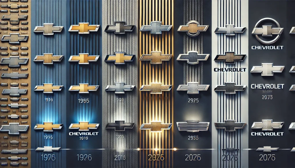
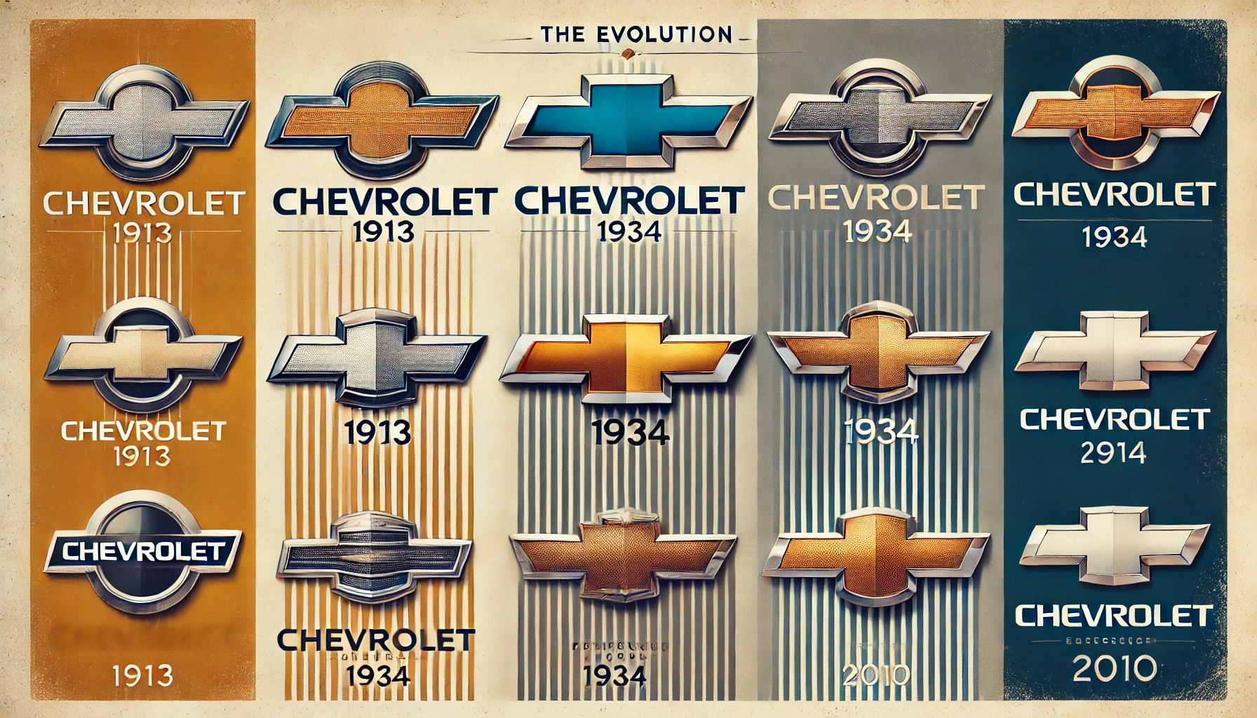
The Chevy logo design has undergone several transformations over the years, adapting to changing trends and market demands. However, the iconic bowtie shape has remained constant, cementing the logo’s place as one of the most enduring symbols in the automotive industry.
1. The Initial Design (1913)
The first Chevrolet logo introduced in 1913 featured a blue and white bowtie with gold Serif-font lettering. The bold design exuded luxury and elegance, setting the tone for Chevrolet as a premium car brand.
2. Monochrome Transition (1934)
In 1934, the logo underwent its first major redesign. The color palette transitioned to monochrome, and the typeface was updated to a modern Sans-serif font, reflecting a more masculine and robust image. This change signaled Chevrolet’s commitment to innovation and strength.
3. Simplistic Era (1940s)
During the 1940s, Chevrolet experimented with a minimalist logo. The bowtie symbol was temporarily removed, leaving an elegant wordmark in Serif font. The stylized “V” in the middle of the logo symbolized victory and progress, aligning with the brand’s innovative vision.
4. Return to Blue and Gold (1950s)
In the 1950s, the blue and gold palette made a comeback, with vibrant royal blue and thick gold outlines creating a striking contrast. The logo also featured a sleek white Sans-serif font, emphasizing modernity and appeal.
5. The Three-Dimensional Era (1994)
The 1994 redesign introduced a three-dimensional Chevy logo design, featuring a glossy blue surface framed in silver. This contemporary design highlighted the phrase “Genuine Chevrolet,” reinforcing the brand’s authenticity and trustworthiness.
6. The Modern Logo (2010-Present)
The latest redesign in 2010 added a textured pattern to the gold color, making the logo more dynamic and eye-catching. The silver framing was made bolder, and the wordmark was shifted beneath the bowtie in narrow lettering. This design represents Chevrolet’s forward-thinking philosophy and adherence to quality.

Chevy Logo Meaning and Symbolism
The Chevrolet logo meaning extends beyond its visual appeal. It embodies the brand’s heritage, innovation, and unwavering commitment to excellence. The bowtie design signifies unity and strength, resonating with Chevrolet’s tagline, “Find New Roads.” Each iteration of the logo reflects Chevrolet’s adaptability and drive to remain at the forefront of the automotive industry.
Chevrolet Logo Price and Its Value
While the monetary value of the Chevrolet logo might not be quantifiable, its intrinsic value to the brand and its recognition worldwide is immeasurable. The logo plays a pivotal role in establishing Chevrolet’s identity and fostering customer trust. For collectors and enthusiasts, vintage Chevrolet logo merchandise and memorabilia often hold significant sentimental and financial value.
Chevrolet Logo Old: A Journey Through Time
Looking back at the Chevrolet logo old designs reveals the evolution of not just a brand symbol but an emblem of changing times. The vintage designs resonate with nostalgia, showcasing how Chevrolet adapted to trends while maintaining its core values. Whether it was the simplicity of the 1940s or the opulence of the 1950s, every logo has a story to tell.
Chevrolet’s Legacy: Beyond the Logo
The Chevrolet logo is more than a brand marker; it is a symbol of an American automotive legacy that has transcended generations. From its inception to its modern design, the bowtie logo reflects Chevrolet’s resilience, innovation, and adaptability. It stands as a beacon of quality, style, and performance, making it one of the most recognizable logos in the world.
Conclusion
The Chevy logo, with its timeless bowtie design, stands as a symbol of Chevrolet’s century-long legacy of excellence, innovation, and style. From its humble beginnings in a French hotel to its modern, dynamic iteration, the Chevrolet logo has evolved to meet the demands of a changing world while staying true to its roots. Whether you’re an admirer of the brand’s history or a proud owner of a Chevy vehicle, the logo’s story is a reminder of Chevrolet’s enduring commitment to delivering the best in automotive excellence.
FAQs About the Chevy Logo
What is the origin of the Chevy logo?
The Chevy logo is believed to have been inspired by wallpaper in a French hotel, as noted by Chevrolet co-founder William C. Durant. Other theories suggest it was inspired by a newspaper ad or a stylized cross symbol.
What does the Chevrolet logo represent?
The Chevrolet logo represents strength, sophistication, and the brand’s commitment to innovation and quality. It is a timeless symbol of reliability and excellence.
How has the Chevy logo evolved over the years?
The Chevy logo has undergone numerous changes since its inception in 1913. While the core bowtie design remains unchanged, the logo’s color, texture, and typography have evolved to reflect modern trends and values.
Why is the Chevy logo often called a “bowtie”?
The Chevy logo is nicknamed the “bowtie” because of its distinctive shape, which resembles a classic bowtie.
Is the Chevrolet logo expensive to replicate?
The monetary value of replicating the Chevrolet logo depends on the application. However, its value to the brand is immense, as it is an integral part of Chevrolet’s identity.
What is the significance of the gold color in the Chevrolet logo?
The gold color in the Chevrolet logo symbolizes opulence, quality, and excellence, reflecting Chevrolet’s premium position in the automotive market.


